Responsive Web Design as Part of Your Social Media Strategy
 The situation is quite familiar.
You are sitting at work on your laptop or desktop, and you find a great article that you want to share it with your Twitter followers and Facebook friends.
So, you click that share button and launch it to the social media sphere.
Problem is that you want share a great article that renders very well on a desktop, meanwhile your Twitter followers and Facebook friends are most likely to be seeing your post through their smartphones. And what happens is that they end up playing a game of scrolling and panning without being able to actually enjoy that insightful article.
Small Businesses are Doing it Too
What is more worrying is that it is just not individuals that are creating this situation. Take a look at the graph below:
According to this Constant Contact May 2013 survey, 73% of US small business are using social media marketing, while only 34% have a mobile-optimized website.
The Downfall of Apps
As Fast Company’s Farhad Manjodo explains:
The app model has become more perilous with the rise of Android. Developers are forced to pick between it and iOS, or build the same app twice–to say nothing of producing versions optimized for iPads, Google’s tablets, Kindles, and maybe even Windows Phone. Suddenly, the promise of apps as a low-cost, high-impact utopia for startups has dimmed–according to comScore, it was Google that published five of the U.S.’s top seven most-used apps for 2012.
No small business has the capability and budget to either keep an in-house web design team to maintain all of these apps or to hire somebody to create those apps for them. However, all small business must have a website. Wouldn’t it be great if we could tackle all of those smartphones and tablets, past, current, and future, at the same time?
There is a way, it is called responsive web design.
The Solution: Responsive Web Design
Ethan Marcotte coined the term responsive web design (RWD) in a May 2010 article in A List Apart. Responsive design is a website design approach aimed at crafting sites to provide an optimal viewing experience—easy reading and navigation with a minimum of resizing, panning, and scrolling—across a wide range of devices.
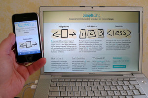
As the image shows, responsive web design (RWD) empowers small business owners to create sites that work well across all possible screen sizes.
A good example of a small size business effectively using RWD is HaymoreEndodontics.com, an endodontics practice in Las Vegas and Henderson, NV. Try viewing this site on your smartphone, tablet and laptop/desktop. You will see that the site effeciently adapts to all these devices. By using images that resize to different browser widths, flexible grids that adapt to devices, and server components that speed up mobile Internet browsing; any small or medium size business can ensure that all of its users, no matter the device they are using, will have an optimized experience.
Responsive Web Design as Part of Your Social Media Strategy
RWD needs to be part of your social media strategy.
As the number of leads from social media channels continues to increase, small and medium size businesses need to have sites that are optimized to all devices.
By Damian Davila, tech blogger living in Honolulu, Hawaii. He writes about the latest trends in online marketing such as responsive design at his blog idaconcpts.com. Read more of Damian’s articles at SexySocialMedia.com here. Follow him on Twitter at @idaconcpts.
Posted in Social Media Tools. Tags: responsive design, responsive web design, Social Media News, social media strategies
No Replies
Feel free to leave a reply using the form below!


