The New Twitter – Love It? Hate It?

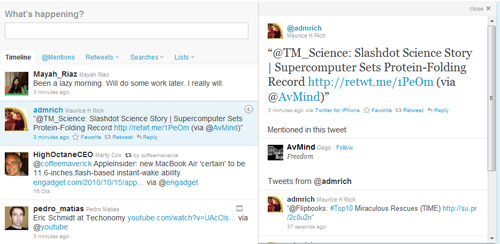
Some people have been test driving the ‘new’ Twitter format since mid-September but now it is a permanent fixture. In addition to a wider page there are options to view the timeline, mentions, retweets, and lists.
The right hand page has a complete redesign and offers suggestions for followers, trends and an easy access to favorites. These changes have resulted from suggestions received from Twitter users. Caroline Penner wrote in the Twitter blog, that “we’re pleased with the positive reaction so far. People are telling us that they love that we’ve kept the timeline simple while also providing a richer experience through the details pane.”
With around 160 million users Twitter’s new version is being greeted with many accolades. One of the most positive points is the opportunity for viewing multimedia without the requirements of having to ‘click’ off-site to see photos and videos.
There are also new navigation controls that help users follow threads. For example the @mentions will pull up all the Tweets that mention you. There is also an opportunity to review Retweets by you and people who have retweeted you.
The stream lined design offers a threaded list of tweets from any user in the timeline. By selecting a user the timeline from that user will be displayed on the right hand of the page.
Overall the new interface seems to allow more transparency and ability to follow and develop more threads. Twitter had a graduated ‘roll out’ that started in mid-September. The option to use the ‘old’ Twitter platform and review the ‘new’ platform was implemented for the past few weeks and allowed users to choose if they wanted to use the ‘new’ Twitter. Now the ‘old’ has been removed. This permitted the users to get their feet wet before making the leap to the new platform.


I love the new Twitter look. I’m actually using it far more than I have done in the past and more extensively.
So far I like it. I agree with Christina. I use it far more now than before.