What’s Wrong with the Recent Twitter Redesign?
In the last several months there have been a lot of changes to various websites that are on the list of the most popular spots on the web. YouTube completely changed their format with a new system of sharing videos, viewing features and suggested content and adding things to playlists and favorites. Facebook introduced their fascinating new Timeline layout that creates a digital story of your life. Now Twitter has done the same.

When it comes to Twitter, the changes were interesting but maybe not as dynamic as the others. But I don’t get why over there has been so much hate since its release. While it was designed to offer a simpler, more direct approach to microblogging, it has been getting a lot of negative feedback by users who say they preferred the original design.
What’s Wrong With It?

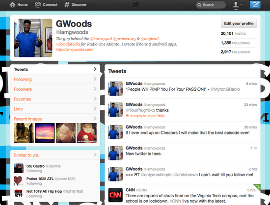
Looking at it objectively, there isn’t just that is truly different. The background image is still there, but the content is more contained within smaller columns. You have a simpler localization of links in their own box, then an expended version of the “similar to” area.
One thing that does bother me a little is that it reminds me a lot of Myspace’s new layout attempt that started sometime last year after the latest takeover of the dying social networking site. Though the Twitter version is less cluttered and so appears cleaner and more well made. So the observation is minimal.
What Do You Think?
Is there something wrong with the redesign? If so, what is it? Did you just prefer the original layout, or has this new one grown on you? Let us know in the comments.
Image Credit: 1.


Same sentiments here – not dynamic. That is my initial observation of the changes on Twitter. It is very minimalist. It should be more active because it’s a busy site. Nonetheless, I think people will get used to it and use it anyway.
The first look of Twitter is more simpler than the latest. I prefer the latest navigation like the Connect and Discover navigation.